Tuesday, December 27, 2016

Top 5 Design Trends in Commercial Buildings

top 5 design trends.png

For commercial buildings, interior design Singapore is changing fast. Stringent design rules have given way to innovation and boundaries have been blurred. ‘Green’ seems to be the buzzword, as businesses turn more sensitive to natural resources and sustainability. Other interior design trends increasingly getting popular are deep tones, inconsistent patterns and doing away with clutter. Designers are giving up conventional layouts in favor of flexibility. If you’re looking for inspiration for your commercial building, here are top 5 design trends.

1. Sustainable interior design

Ever since the BCA stressed on the importance of green environments for offices, there has been a rise in the trend. Sustainability not only lowers utility bills, but boosts workers’ productivity. Make energy efficient choices in your interior design, for instance, using photovoltaic glass instead of traditional glass.

Get furniture made from recycled content and design the space in a way that daylight can be maximized. Focused task lighting helps minimize the use of general lighting. Having an efficient video conferencing system can help reduce carbon footprint by cutting out work-based travel.

2. Open gathering areas

Workspaces are beginning to be designed according to the needs of the modern professional. Interior design, hence, is collaboration-centered, and dominated by open workspaces. The community table is a great example of this trend. In commercial spaces like hotels and restaurants, shared tables are coming up.

Wireless technology has also brought in designated lounge areas. In shopping complexes, this is marked by spread-out sitting areas and benches lined up at long stretches. In case of adjoining desks, the transparent separating panels are a good idea.

3. Using geometric patterns

Geometric patterns are here to stay, and simplicity in design is the key. Minimalist geometric patterns are increasingly being found in commercial spaces, especially in high-end boutiques and retail stores. This helps to showcase merchandise, and at the same time, keeps interior design aesthetically pleasing.

Geometrical patterns have been regularly used in hotel flooring. However, the latest trend is to make them more dramatic, infuse colors, and have them in quirky combinations. This can help express uniqueness and create a lasting impact on visitors.

4. Blending indoors with outdoors

This complements sustainable design well, with reclaimed wood panels; natural fabrics for artwork exposed, and concrete flooring. One of the major recent trends in interior design for commercial buildings is to get more outdoor elements in the scheme. There is a greater focus on daylight, and reflective surfaces and skylights are getting popular.

Greenery, too, can be used indoors as an external element. Plants, and a healthy access to vegetation, are becoming a major requirement for commercial buildings. Bringing plants inside has the added benefit of getting a dash of freshness and color into an otherwise monotonous space.

5. Preferring form over function

Functionality is one thing, and comfort is yet another. Unlike earlier, when cost decided the choice of furniture in commercial buildings, it is governed by ergonomics now. The trend includes using chairs with head rests and adjustable arms. Standing desks, too, are being favored to reduce sitting-related problems.

However, commercial interior design always offers scope for cost-effective solutions. Lounge chairs with tablet arms, cabinets with slide-out seats, oval-shaped tables are good examples.


from Articles http://www.summerhaus.com.sg/articles/2016/12/27/top-5-design-trends-in-commercial-buildings
via Summerhaus Dzign

Thursday, December 22, 2016

New Year’s Resolutions to Improve Your Interior Décor

Interior décor is all about positive and refreshing change. What was classy in the past could mean cold and lifeless in 2017. This year, instead of taking up difficult New Year’s resolutions, vow to improve your interior design Singapore. Get over fads of the past and introduce fresh elements. Embrace your empty spaces and resist the urge to fill them with furniture and objects. Here are a few New Year’s resolutions that can help you better your interior décor.

Experimenting with minimalism

While experts still vote in favour of multiple elements of interest in smaller rooms, clutter is never welcome. After putting up for years, with knick-knacks and useless pieces lying here and there, go minimalist in 2017. Minimalism in interior design has been a major movement in the recent years. Let go of old pieces, clear out table tops and shelves, and opt for baskets for added storage.

Adopting sustainable design

Sustainability will be a major trend in the coming years, as far as interior design goes. More and more people are becoming ecologically aware, and are opting for eco-friendly material. Choose furniture made of reclaimed wood or better options like bamboo and coir. Install water harvesting systems and use fibres and paints free from pesticides.

Accepting bold patterns

Design pundits are of the opinion that bold graphics will be back in 2017. Get over understated designs and choose loud patterns to decorate parts of your house. Have a colourful, patterned rug in the entryway, or ethnic wall art for the living area.

Bringing colour back

Going all monochrome was a popular interior design trend a few years back. However, giving up colour can take away energy from a home. Have colour make a comeback by adding two accent colours to a room with white walls. Get cushions in matching colours for the sofa. Do not go overboard with colour, though. 

Infusing life in the home office

When it comes to designing your house, the home office is often ignored. Change that practice and spruce this area up. Get your old inspirational posters out and deck a wall with them. Curate knick-knacks, photographs, and other art pieces for a corner of the home office. Take a resolution to make your workspace inspiring and original.

Getting inspiration from different sources

Move over clichéd sources of inspiration in 2017. Design ideas on platforms like Pinterest, Instagram, magazines, and blogs are no longer unique. It could be a brilliant New Year’s resolution to look at unconventional sources of inspiration. Incorporate elements from a restaurant or hotel lobby you visited. Public spaces, gardens, and museums are good ideas as well.

Introducing greenery

You could have been ignoring this wonderful resolution all your life. Bringing more plants in your interior design scheme is a cost-effective way to breathe life into a space. Have vibrant and low-maintenance varieties of indoor plants all around the living room area.

Flowers can add colour as well. Rubber trees for excellent indoor plants, eliminate toxins, and purify the air around. English Ivy is a great option if you want to hang your plants.


from Articles http://www.summerhaus.com.sg/articles/2016/12/21/new-years-resolutions-to-improve-your-interior-dcor
via Summerhaus Dzign

Friday, December 16, 2016

Interior Design Trends to Watch Out for in 2017

Interior design Singapore is slated to undergo some major upheavals in 2017. For instance, experts predict that pastel shades will make way for jewel tones. Escapism in urban dwellings will appear, with elements like reading nooks and oversized loveseats becoming a regular feature. Functionality in furniture and natural textures are expected as well. Read here about interior design trends you should watch out for in 2017.

Modular furniture schemes

Functionality and modularity go hand in hand. Modular furniture is a result of creativity and functionality. The nomadic furniture system is a good example. In this system, furniture consists of freestanding modular pieces. Transportable, space-saving systems, with metal frames in different sizes and versatile wooden hinges, provide practicality and elegance to interior design.

Elements of vintage interior design

Retro inspiration will be back in 2017, with designs inspired from sets of movies from the 60s and 70s. Elements like greenery, wooden beams and brick walls are interesting inputs for a vintage décor scheme. Retro effects for furniture include cane-back chairs, solid wood chairs with curved backs, and lounge chairs. Layered lighting can help to complement your home's vintage design.

Minimalistic bathrooms in urban homes

Private and smaller bathrooms are going to be the trend for 2017. The era of large bathtubs and spaces for toilette is over. However, smaller and neater does not have to mean compromises in terms of style, functionality, and comfort. You can make up for the lack of surplus space by investing in high quality fixtures. Incorporate contrast in the scheme, using hardware in dark colors with a neutral color palette.

Touches of metal in décor and furniture

Be it copper, warm gold, steel or cool chrome, metallic finishes are expected to be a hit in 2017. This includes interior design inspired by space, stars, metals, and the cosmos, along with elements like transparent fabrics, sheers, and silks. For a striking effect to a room, bring in silver finishes, including chrome and stainless steel. Metallic finishes can help subtly heighten the mood in a room. They can also be combined with white plaster.

What is in for 2017?

Certain elements from the past, like marble home-ware and open floor plans will make way for others. The elements of 2017 include:

Artsy wallpapers

Organic wallpapers that will look like murals and not plain wall coverings will be popular. Textures like sea grass and rice paper in mural and floral styles will lend an artistic touch to the interior design.

Terracotta

Warm will the more preferred option over cool. Terracotta tiles, with a matte finish, would come in for feature walls in bathrooms.

Cork

This is another material that adds warmth to a space. Cork is also stylish and can absorbing noise in homes with open floor plans. Doing entire walls of segments to pin notes is an interesting idea.

Darker shades of green

Shades of blue will be passé in the coming year, as green in dark shades will be a popular interior color. One can either use it as a paint color for their bedroom or as an accent element for furniture.


from Articles http://www.summerhaus.com.sg/articles/2016/12/16/interior-design-trends-to-watch-out-for-in-2017
via Summerhaus Dzign

Tuesday, December 13, 2016

Tips for designing your home office

More and more Singaporeans are taking up the provision of working from home. They can have a better work-life balance and work in an environment that they are actually comfortable with. However, designing a home office that you will actually enjoy working in could be a challenge. It is essential to distinguish workspace within your home. The right interior design can help you achieve this. Here are some useful tips on designing your home office.

Emphasize the role of the space

You could dedicate an entire room to a home office, or a corner in a large room. However, what is important is to find a focus to base the rest of the interior design around. If you have allotted just a desk to your workspace, the emphasis could be your computer. Keep it towards the front and to the center of the desk.

Plan the lighting well

Never set up a home office where you do not get enough natural light. This would mean going back to the uninspiring feeling of a corporate cubicle. Place the desk parallel to the windowpanes. This way, you will not be straining your eyes too much. Consider getting light fixtures for different intensities of light. A desk lamp is indispensable. A good lighting sets your mood to work.

Design ergonomically

Place your computer so that the top of the screen is at eye level. Scanning down the screen will keep moistening your eyelids and hence avoid eye fatigue. You should position the keyboard such that you can keep the arms parallel to the floor. Your feet should rest firmly on the floor. If needed, get a footrest. Invest in a desk chair ergonomically designed or at least get seat support.

Blend functionality with design for storage

Filing cabinets are important pieces of furniture, without which there would be too much confusion and lost documents. Hang magazine-rack-style cabinets or display shelves on an accessible area of a wall. If you have spare closets in other rooms, add shelving systems to them to minimize shelving in the home office. Alternately, you can try metal cube storage to keep books, to-do notes, pens and other knickknacks.

Lend greenery to the space

Plants are a significant addition to a space that needs frequent refreshment. Greenery also adds positive energy to the interior design. Plants like Cacti and Southern Yew can go a few days without water, for days you plan to take off from work. Moreover, office spaces can get monotonous and greenery can lend brightness and color.

Personalize in a corner

Interior design for the home office needs personalization as well. You can put the wall hangings, flower vases, photographs, and posters in a corner above a corner table. You can also display mementoes or achievements in glass shelves around this area. However, be sure to keep changing the arrangement every now and then. You may also want to get this space scented.

Get rid of clutter. Important work-related things like your day planner and phone should not be buried under the rubble of papers, cords, and random things. Get a desk organizer to maintain the harmony of your interior design.


from Articles http://www.summerhaus.com.sg/articles/2016/12/14/tips-for-designing-your-home-office
via Summerhaus Dzign

Tuesday, December 6, 2016

Essential qualities of an interior designer

The job of an interior decorator involves combining creativity and functionality for homes and other spaces. When it comes to interior design in Singapore, you must be able to bank on your designer to help get your ideas to life. They should be able to listen to your requirements carefully and offer valuable advice.

Look for reviews online or ask for referrals when choosing an interior designer. Here are some essential qualities of an interior designer.

They should estimate project durations well

This is because durations for every project are different. For instance, designing a living room can take 1-2 months to complete. In this case, the owner has a fair amount of time to buy products and start constructing. Delays and lags are a part of such projects, and good interior designers can estimate accurate duration for different projects.

They should be able to give a cost breakdown

Interior design is a matter of taste and education. Hiring someone just because they come cheap is not worth it. However, it is definitely one of the deciding factors. This means that they should be able to provide a clear breakdown of the cost. This generally depends on where you live in Singapore. Either they could charge you on an hourly basis or quote a fixed rate based on the entire project.

Ask for hourly rates if you want space planning or design drawing. Fixed rates are for larger projects like construction of a new home or full remodels. Based on their experience, a good interior designer will spell it all out in their contract.

They should keep the project on the right track

Interior designers should be able to manage people well. A project involves dealing with contractors, the client, and other people. This is where experience counts the most. You could also want your family members to be present when important interior design decisions are made.

Delays and setbacks cannot be avoided in longer projects. Hiring an interior designer can help with sticking to deadlines. Decisions and opinions can eat up a lot of time, and the interior designer should be able to provide the right options to avoid wasting time.

They should be good with visual detail

A good amount of an interior designer's job involves getting the designs from the mind on to the paper. If the client has a specific interior design requirement, the decorator must be able to quickly draw up a sketch of the same. Good interior designers have a knack for inspecting and surveying buildings.

They should have an inherent drive for doing creative work

Interior design is not all planning and calculation. Whether experienced or newcomer, a good designer will always be enthusiastic about a project. They should offer their insights about things like cost-effective options, colour combinations and durable building material.  They should also be able to collaborate with the other contractors to offer advice on paint, furniture, and plumbing. Good interior designers often have their own contacts as well. This helps them enjoy creative freedom and keep other project activities on track.


from Articles http://www.summerhaus.com.sg/articles/2016/11/30/essential-qualities-of-an-interior-designer
via Summerhaus Dzign

Tuesday, November 29, 2016

How an interior designer helps you save money

If you are building your home for the first time, it is necessary to consult an interior designer. Even if you are renovating or building your second home, it is important, because you would want to avoid making old mistakes. Interior designers bring experience and valuable insights to your building project. It might sound counterintuitive but hiring a designer actually helps you save money.

Designers understand the fact that you have a budget. They can plan accordingly. The money you save can be later utilised for décor and furniture. Read here how an interior designer helps you save money.

Saves your time

Time is money. When you hire a designer, you do not have to take days off from work. Moreover, interior design in Singapore is their domain and they can handle it better.

The designer will put in the time and effort that this major investment requires. Designers draw up timelines beforehand and prioritise accordingly. You can coordinate with them and track progress on a daily basis.

Gets you more discounts

Designers are a part of a community, which makes them privy to a number of discounts and insider information. Hiring a designer, in effect, means availing décor items at wholesale prices. You can even ask your designer to get you contractors for woodwork, painting, and plumbing at a competitive rate.

Designers and contractors often work together and hence get better rates. Moreover, managing contractors hired separately can be a problem. However, your interior design can liaise between you and your contractor as well.

Help repurpose your old décor items and furniture

Avoid buying new and expensive furniture pieces. Interior designers, basically, are creative people at heart. They like the challenge of having to repurpose old pieces. Be it your flooring, lightings, an old sofa or your cabinets, just ask your designer about the possibility.

The designer, with their training and creativity, can accommodate these pieces in their plan. Getting your old chairs reupholstered instead of splurging on new ones will mean saving a lot of money.

Help avoid costly reworks

Design enthusiasts designing their own home often make costly mistakes that would take a lot more to repair later. This is because as an amateur, there are aspects of interior design that you don't have mastery over. For instance, there could be a problem with lighting. Another common mistake is choosing paint colour before planning the furniture and flooring.

You could also run the risk of over-furnishing a room or buying out of scale furniture. Correcting these errors means undertaking a fresh renovation project. Hiring a professional for interior design helps avoid such costly reworks, so you can save more.

Help raise resale value

Think about the future. You may decide to sale your house sometime. It could also be that you are moving in temporarily and would need to sell it in a couple of years. Hiring a professional for your interior design will help raise the resale value of your house.

Investing a little more in upping the look of your house will impress visitors and prospective buyers no end. You can get higher rates if your interior design is tasteful.


from Articles http://www.summerhaus.com.sg/articles/2016/11/22/how-an-interior-designer-helps-you-save-money
via Summerhaus Dzign

Thursday, November 24, 2016

Tips and ideas for designing your home library

The library is a serene space in an otherwise busy house. Nowadays, it is usually combined with the study or the home office. The interior design of a library is actually a lot more than just about books and shelves. It helps you define what being a bibliophile means to you. Having the right decor and furniture is equally important. Read some tips and ideas on how you can design your home library.

Paint the walls in dark colours

For the shelves, brown and grey are popular colours. Though contemporary styles also favour bright shades like lime and aqua blue. For the walls, dark colours help add drama and depth to the space. You should experiment with darker shades of colours like red as well. To keep the interior design consistent, make sure that you do not use too many colours in your library.

Shelves and furniture

Keep the theme flowing throughout the shelves, flooring and furniture. Add a dash of pop, with ottomans in warm colours. You can use dark-stained wood for the shelves. Use comfortable fabrics like leather or chenille for your seating furniture. A coffee and an end table are a must. You can even mark out the seating area with an area rug.

Vary your lighting

Unless you have a light flooded library with glazed windows et al, adequate lighting is an absolute must. Lighted bookshelves are an interesting idea. Floor lamps can be fixed adjacent to a couch or chair. Other options for lighting include recessed ceiling lighting and brass-base lighting. There would be times when you would want to dim the lights and create a cosy ambience. A fireplace can provide that.

Decor and accessories

A home library is incomplete without accessories. Display your valuables and prized possessions in the shelves. An entire wall or an awkward corner can be decorated with a series of paintings or wall hangings. A wide range of accessories, including French lamps, portraits, chandeliers, seashells and even a chessboard, can be employed. Wall décor ideas include plastered walls in rattan shades.

Combine it with your media space

You might not have the dimensions for a round library. But you can still have a luxurious combination of a media room-cum-study. Invest in a decorative wooden ceiling and have shelves all around the space. Include a spacious seating arrangement to the centre, complete with a stylish coffee table and a grand media centre.

Opt for masculine vibes

Adding elements of masculine interior design can add a historical feel and grandeur to the library. This is especially exciting for serious readers. Get fully panelled walls, an imposing desk and a custom bench that has corner arms. Incorporate more wood in shelves and furniture for a masculine vibe.

Go ahead with a contemporary design

Contemporary library design demands functionality. Get multipurpose furniture, for instance, a large table for studying and hosting dinner parties as well. Choose ottomans over cocktail tables, especially if you are short on space. Get narrow, open shelving to flank either side of the door. For an industrial feel, have your shelves made from recycled wood and metal rods.


from Articles http://www.summerhaus.com.sg/articles/2016/11/21/tips-and-ideas-for-designing-your-home-library
via Summerhaus Dzign

Tuesday, November 15, 2016

How do you know if you need an interior designer?

The interior design of your home needs to follow your own unique sense of style. If your home lacks your characteristic attitude towards life, it would be a good idea to hire an interior designer. If you are too occupied by your job to design your home, which is a time-consuming and exhaustive process. To know when you need an interior designer, read on.

If you want to spend your money wisely

A minimalist design always win as it helps a house owner to spend more wisely. If you want to make sure this money is not spent on the wrong choices, you need an interior designer. You would not want to waste your money, making last minute changes or repairs.

Interior designers provide drawings and insights to help you safely estimate costs. Moreover, you can save money by looking for young designers looking to start out. Hiring a designer helps you save money in the long run.

When you are open to professional suggestions

Hiring a professional for your interior design is not just about physical service. It is about the expertise they are able to bring in. If you have a starting idea and need a professional go-ahead from a professional, you need an interior designer. Moreover, interior design professionals are aware of safety codes and quality standards that you might not be.

Designers talk from education and experience. Technicalities need to be weighed in along with the creative aspects of design.

If you want to get the job done in time

You could be pressed for time, and need to get a project over in a designated duration. Such a situation calls for hiring a designer. Interior designers can help with schedules and thus help contractors monitor progress. Not hiring an interior decorator can mean endless delays because of clients not being able to finalize designs and layouts. In that case, hiring a designer will help figure out a realistic schedule and avoid unnecessary labour costs.

When you want to design your home well

You might have already figured out what elements you would like your home to have. If you are not sure about your choices of furniture, colours, fabrics and accessories, consider hiring a designer. Fitting these into a suitable layout is important. They will offer expertise on colour combination, furniture styles and a cohesive look for the entire house. Hiring a professional also helps you have an interior design that fits your pocket.

If you want to use resources not many know about

Interior designers can access a vast selection of materials, products and furnishings that are available only to insiders. They can let you in on what really would be the best choices for your flooring or the colour of your walls.

There is a difference between visualising the design of a space and actually executing it. No matter how much of an interior design enthusiast you might be, professional intervention has its advantages. Moreover, you can hold only yourself accountable in case of a botch-up.


from Articles http://www.summerhaus.com.sg/articles/2016/11/8/how-do-you-know-if-you-need-an-interior-designer
via Summerhaus Dzign

Monday, November 7, 2016

Top 7 design ideas for small dining area

A small dining area does not necessarily end every scope for interior design. Whether your dining area is adjoined with an open kitchen or is a small dedicated room, you can still plan it well. Painting the room in bright colors can impart the illusion of spaciousness. Benches provide better seating than chairs in small dining spaces. The idea is to introduce functionality to the space. Read the top 7 design ideas for such small dining areas.

Avoiding visual fragmentation

Interior design for small dining areas is all about doing away with visual fragmentation. This can be done by having transparent dining tables and chairs. You will need circular tables with glass tops and chairs in acrylic for creating this effect. This maximizes the space on the table without the room getting too cramped up.

Using the kitchen island as a dining space

The island is a staple piece of storage furniture in kitchens. It can be further utilized by extending the top that forms a casual dining table for your guests. Moreover, this innovation makes cooking more sociable and enjoyable. You can get your island customized. If not, buy one with a pull-out table. The dining top can be conveniently pushed back inside when not in use.

Increasing the functionality of walls

Devoting four walls to the dining area is a redundant idea when it comes to modern interior design. Open floor plans allow greater functionality and let different areas blend into one harmonious space. Introduce area rugs, recessed lighting and contemporary décor. If you cannot help having walls, work on their functionality. Ideas for this include wall-mounted drop leaf tables and folding chairs.

Setting up breakfast nooks in the corners

Breakfast nooks are a smart addition in dining rooms that are short on space. Add cabinets and storage shelves to utilize vertical space. Breakfast nooks can have two to six seats and provide a cozy space for guests to mingle. Cramped corners can be used by placing two banquettes. Combine interior design with functionality by having hidden storage under seats.

Investing in cafe-style furniture

This can not only provide space saving interior design, but give your dining area a trendy look. Get a bar height table customized for your dining area. It takes less floor space than a traditional dining table. You can opt for higher-than-usual coffee tables as well. Bring the cafe ambience home by bringing a wooden bar to a living room window.

Going for smart shelving

You should not waste storage space in small dining areas. The idea is to avoid cabinets and instead go for open shelves. The doors of cabinets can make a room look stuffy and wastes space. Furthermore, open shelving offers flexible storage options. You can also go for built-in shelves and banquettes along the walls.

Designing for visual illusion

Visual trickery can impart the illusion of the dining area being much larger than it actually is. This can be achieved by getting mirrors to adorn the space. The reflection fakes extra space. Moreover, the bouncing light makes the area brighter. Painting the walls in bright colors gives the illusion of space as well.


from Articles http://www.summerhaus.com.sg/articles/2016/11/8/top-7-design-ideas-for-small-dining-area
via Summerhaus Dzign

Tuesday, November 1, 2016

Top 5 tips for designing your balcony

bigstock-Gorgeous-luxury-house-with-a-b-93570491.jpg

While talking about interior design in Singapore, one generally mentions the interior of a house, for instance the bedroom and the living room. The truth is that the balcony area is as much a part of your home. Balconies are a link between the outside and to your house, therefore, it deserves equal attention. In fact, they present totally different challenges and opportunities for design and décor. Here are 5 tips on designing your balcony.

Go for a green balcony

Potted plants, be it ornamental or flowering give your balcony a fresh feel. You can even have herbs in small pots along the rails. Having plants in the balcony allows you to express your unique interior design. Go for colours that go with your style; aromatic plants and bonsai trees are an interesting choice.

Garden style balconies are especially suited to tropical places like Singapore. Vertical gardens are popular because of their self-irrigating feature. If there is a shortage of space, you can hang plants on the outside.

Light the balcony up

Just like in the rest of your interior design, get proper lighting done for your balcony. Fairy lights can be put up all year long. For subtler ideas, try metal or paper lanterns or even candle stands. Be sure to put candle stands in a place that doesn't get a lot of breeze.

Wall sconces are a sophisticated choice for balcony lighting. However, it is important to ensure that you are not brightening up the area too much.

Fabrics can provide softness

Bring softness to your balcony area by using fabrics. These can be in the form of a waterproof-rug or cushions with coarse fabric covers. Colours like pink, teal and yellow add to the softness. You can bring the indoors outside with a hammock with squishy cushions.

You can also hang woven drapes or those in sheer or lace around the balcony over the rails. Add a swing chair and a matching rug to the scheme and you have a cosy, private 'indoor' balcony.

Have the right seating for the space

The size and shape of the seating will be determined by the area of your balcony. For spacious balconies with a roof to protect from inclement weather, you can have an entire bistro set and deck chairs. Add a bean bag if the space allows.

Mediterranean furniture is an excellent choice if you have a lot of plants in your balcony. For smaller balconies, interior design should be a mix of functionality and creativity. Interesting options are foldaway chairs, ottomans, swing chairs and even chests.

Add the right accessories

Smaller balconies do not allow much scope for large pieces. Accessories provide decorative accents and are in line with your interior design indoors. Table linens, baskets, stuffed toys and colourful cushions are commonly used in balconies.

Even in spacious balconies, accessories add to the flavour of your existing scheme. Have small magazine holders, vases, and even vertical artworks. Smooth pebbles can make for natural doormats. Mini-chandeliers, wind chimes and bamboo-style walls impart an ethnic look to the balcony.


from Articles http://www.summerhaus.com.sg/articles/2016/11/2/top-5-tips-for-designing-your-balcony
via Summerhaus Dzign

Wednesday, October 26, 2016

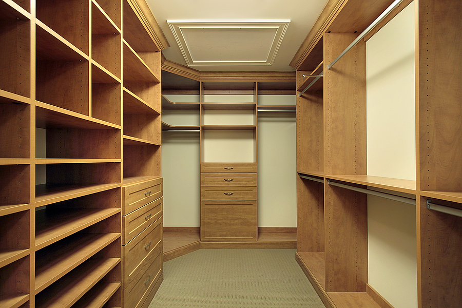
Bedroom closet design ideas

A bedroom closet doesn't merely store your items. It is a vital part of your interior design. It should be able to incorporate your changing storage and style preferences. Colour can help add a dash of surprise and style to your closet. From area rugs to sliding doors and multiple levels of hanging rods; there are a number of elements that help you achieve a unique style for your bedroom closet. Read here about some exciting bedroom closet design ideas.

Hidden closets to utilise space

Sometimes, lack of space can force you to reconsider your decision of having a bedroom closet. When even a normal master wardrobe seems unmanageable, you can try out a hidden closet. These can be built behind panels and doors. Hidden closets generally make use of height and not width. You can have a jewellery drawer at the bottom as well.

Experiment with masculine designs

Use colours like stark white, rich brown and bold green to introduce a pleasant, masculine feel to the interior design of your closet. Paint all the cabinet doors in one colour, for instance, green or beige. This gives a unified look to the cabinets. Add a pinch of feminine style with a white chandelier.

Invisible storage

Visibility and easy access are necessary elements for a bedroom closet, hence making sure that lighting is ample in the bedroom closet. However, you need not keep your closet open at all times. Instead, divide the space with curtains with stylish patterns or double-folded montage doors. Frosted glass imparts a chic look to your closet doors. If you go ahead with frosted glass, be sure to have proper lighting.

Spa-themed interior design

If you want luxury and comfort within your bedroom closet, this idea is for you. Have wicker basket drawers to keep closet essentials close. Have a uniform colour scheme for the entire space. Add spa accessories like massagers and steamers with wooden hangers for an authentic feel.

Lighting up the closet

Reach-in closets mostly do not receive any sunlight. Even in open closets that receive sunlight, there is the danger of your collection getting damaged. This gives you a chance to play with lighting and give ample exposure to your interior design. Have different levels of lighting for your shelves. You can have battery operated LED lights or even vintage lamps. Avoid hardwiring.

Matching with floor and furniture

This is for wardrobes and reach-in closets. You can have the closet and the bed made with the same material. This provides a unified look for the bedroom. Add a nice chair made of the same material to complete the look. You can also have the same colour for the closet and the floors. Have reflecting doors for the closet to complement the walls.

Boutique style walk-in closet

Spending a little more can transform your walk-in bedroom closet into a master suite closet. Start with dual frosted glass doors and complement it with cherry wood cabinets. Combine different styles of storage using hanging rods, drawers and open shelving for the top. To keep the scheme subtle, have maple cabinetry and crown moulding for your closet. Finish with an elegant bookcase.

A bedroom closet doesn't merely store your items. It is a vital part of your interior design. It should be able to incorporate your changing storage and style preferences. Colour can help add a dash of surprise and style to your closet. From area rugs to sliding doors and multiple levels of hanging rods; there are a number of elements that help you achieve a unique style for your bedroom closet. Read here about some exciting bedroom closet design ideas.

Hidden closets to utilize space

Sometimes, lack of space can force you to reconsider your decision of having a bedroom closet. When even a normal master wardrobe seems unmanageable, you can try out a hidden closet. These can be built behind panels and doors. Hidden closets generally make use of height and not width. You can have a jewellery drawer at the bottom as well.

Experiment with masculine designs

Use colours like stark white, rich brown and bold green to introduce a pleasant, masculine feel to the interior design of your closet. Paint all the cabinet doors in one colour, for instance, green or beige. This gives a unified look to the cabinets. Add a pinch of feminine style with a white chandelier.

Invisible storage

Visibility and easy access are necessary elements for a bedroom closet, hence making sure that lighting is ample in the bedroom closet. However, you need not keep your closet open at all times. Instead, divide the space with curtains with stylish patterns or double-folded montage doors. Frosted glass imparts a chic look to your closet doors. If you go ahead with frosted glass, be sure to have proper lighting.

Spa-themed interior design

If you want luxury and comfort within your bedroom closet, this idea is for you. Have wicker basket drawers to keep closet essentials close. Have a uniform colour scheme for the entire space. Add spa accessories like massagers and steamers with wooden hangers for an authentic feel.

Lighting up the closet

Reach-in closets are mostly do not receive any sunlight. Even in open closets that receive sunlight, there is the danger of your collection getting damaged. This gives you a chance to play with lighting and give ample exposure to your interior design. Have different levels of lighting for your shelves. You can have battery operated LED lights or even vintage lamps. Avoid hardwiring.

Matching with floor and furniture

This is for wardrobes and reach-in closets. You can have the closet and the bed made with the same material. This provides a unified look for the bedroom. Add a nice chair made of the same material to complete the look. You can also have the same colour for the closet and the floors. Have reflecting doors for the closet to complement the walls.

Boutique style walk-in closet

Spending a little more can transform your walk-in bedroom closet into a master suite closet. Start with dual frosted glass doors and complement it with cherry wood cabinets. Combine different styles of storage using hanging rods, drawers and open shelving for the top. To keep the scheme subtle, have maple cabinetry and crown molding for your closet. Finish with an elegant bookcase.


from Articles http://www.summerhaus.com.sg/articles/2016/10/19/bedroom-closet-design-ideas
via Summerhaus Dzign

Tuesday, October 18, 2016

7 awesome kitchen storage design ideas

The kitchen is home to a lot of appliances like cookware and other specialty gadgets to make cooking a breeze. Managing storage without disturbing your interior design scheme could be difficult. This is especially true for smaller kitchens. However, with innovative thinking, you can utilize every inch and make the most of your space. For instance, linear alignment of cabinets and countertops can provide an illusion of depth. Here are 7 brilliant kitchen storage ideas.

1. Know when to use cabinets and drawers

You might be tempted to use cabinets as they cost slightly less than drawers. But drawers allow more depth and width. Wide and deep drawers are better when there is space available. Otherwise, cabinets work better. You should also utilize the narrow banks to store linens and silverware. Cabinets up to the ceiling make for great interior design.

2. Use space-saving adjustments

You should prioritize utility in your kitchen's interior design. Swivel stools under counter are a great way to combine functionality with style and save on seating space. Corner drawers are a recent invention that let you avoid awkward corners. They run diagonally into corners and are hence deeper. Appliance garages on the counter also help allocate a clutter-free space for coffee or juice stations.

3. Reclaim lost sink space

Scrubbers, wet sponges and soap can not only make the sink space look messy, but hinder space management. Get a couple of desk organizers and hang them either by the window sill or the sides of cabinets. Under-sink drawers to store cleaning supplies are another innovative addition to the otherwise wasted under-sink space.

4. Use narrow, left-out spaces

Narrow spaces can be used to make pull-out pantries that store both supplies and crockery. One good idea is to have a tiled front so as to make the pantry look like a part of the wall when closed. Narrow spaces can also be transformed into crockery drawers.

5. Combine interior design with utility with islands

Islands are a versatile addition to the interior design of the kitchen. You can use them to carve out built-in pet bowls and keep your pets away from the cooking area. See-through cabinets placed at the end of an island can be used to stack your crockery in style. An island with diagonal shelves can also be used to store wine bottles.

6. Have storage on the inside of doors

Small kitchens often lack the space for a proper, walk-in pantry. The solution is a pull-out organizer along with racks on the cabinet doors. You can even store crockery or clutter behind doors. You can hang frequently used utensils like spoons and ladles on the inside of doors too.

7. Go ahead with vertical storage designs

You can go for a vintage interior design scheme by having an étagère in your open shelving unit. It can hold books, bowls and other kitchen essentials. Shipping pallets are another innovative way to hang spoons, cups, knives, and even small bottles. Pallets are quite sturdy and let you combine style with effective storage. Old slatted doors can also be used to hang supplies. No matter how stylish you want your kitchen to be, do not forget the importance of having the correct lighting to make your cooking a breeze and effective.


from Articles http://www.summerhaus.com.sg/articles/2016/10/10/7-awesome-kitchen-storage-design-ideas
via Summerhaus Dzign

Tuesday, October 4, 2016

4 types of lighting any room must have

Most people pay a lot of attention to furniture, kitchen and bathroom furnishings, and other arrangements. However, to get the desired effect with all these, proper lighting is essential. Your beautiful décor will go unnoticed, without the right lighting. This is because lighting helps you determine just the right amount of light that should go into demonstrating a particular corner or object in the room. For instance, shadows help create a dramatic mystery. To know the different types of lighting any room must have.

Ambient lighting helps set the tone

Ambient lighting offers common illumination. This illumination is evenly spread throughout the entire room. It is most often found in chandeliers, ceiling fixtures and other sources of recessed lighting. Using recessed halogens, you can create an illusion of space and complement your interior design in Singapore.

However, when it comes down to lights, there should not be too many of them. Based on the amount of daylight available, you can create an illumination by using dimmers.  If you want to alter the mood and the brightness of the room, lighting can be controlled through dimmers. Multiple circuits allow you to keep some lights bright while dimming others.

Task lighting can be used to intrigue

Task lights help direct concentrated lighting to help you perform tasks like reading, writing, and cooking. It also helps to create fascinating shadows. You can use table lamps around chairs in the living room. In your kitchen, consider using pendant lighting and lights under the cabinet to illuminate areas of food preparation. In the bedroom, using floor lamps is a great idea.

Without proper task lighting for bathrooms, interior design is incomplete. Bath bars and sconces are alright, but pendant lights provide a contemporary look. However, task lighting in bathrooms needs illumination as well, so that applying make-up and shaving can be done properly. Make sure that you have equal light coming in from the sides and the top.

Accent lighting

To balance the contrasts created by task lighting, accent lighting should be used. Accent lighting lets you layer well. If there are specific objects of interest, like art pieces, bookshelves and sculptures, you can illuminate those using decorative sconces, picture lights or even candlelight. In fact, if you are planning to have accent lighting play an active role in your interior design, have a textured wall in your living room. However, remember that accent lighting is not for studying or working, for creating an atmosphere. If you want to have wall art in spaces without outlets for lights, consider using battery operated picture lights.

Decorative lighting

The latest trend in decorative lighting is indirect lighting. To include this in your interior design scheme, use indirect pendant fixtures to cast light upward. This makes light bounce back towards the ceiling. You could also use more conventional sources of decorative lighting, like candle stands made of wrought iron, or butterfly-shaped lamps. Another idea is to use pendants that provide diffuse lighting. Some examples are bare lamps, globe lights and chandeliers.


from Articles http://www.summerhaus.com.sg/articles/2016/9/26/4-types-of-lighting-any-room-must-have
via Summerhaus Dzign

Wednesday, September 28, 2016

Interior decor ideas for a single man's bedroom

A single man's bedroom is referred to his 'cave' in the interior design fraternity. It is a place to which he retires after a long and hard day at work. It could be minimalist or even rustic, and should underline the man's personal idea of style. If you are a bachelor looking for inspiration to design your bedroom, try to recollect the best hotel room you've lived in. Men often look for features inspired by automotive design, but in spite of all, it should be cozy and comfortable. Read on for some effective advice on a single man's bedroom.

Comfort is a must in a man's bedroom

Quality, comfortable furniture has to be bought keeping both form and function in mind. If you are going for a bedside chair, get a lounge chair or one built with a cup holder in the handle. Bean bags could seem comfortable from a distance, but they haven't really been designed keeping the human form in mind. Stay away of them and get a Barcelona Chair as it affords the utmost comfort. Rather than splurging on the wall unit, get a comfortable mattress.

Go for decor that offers functionality

Simplicity is synonymous with masculinity, at least when it comes to interior design in Singapore. Bachelors' bedrooms should have a careful combination of furniture and decor. The must-haves of a young man's bedroom are a basic bed in grays and other solid colors. Angular lines offer more masculinity. A little leather chair looks great in the bedroom. Have a tidy dressing area and cupboard component alongside. You could alternately have a black-and-white themed bedroom and a lounge chair beside the bed.

Neutral colors are a good choice

Neutral colors are a man's best friend. They are a safe choice and are versatile. They also let a man host others in his bedroom and accommodate their style. White, black and gray are great choices. If you want to add additional colors, it is better to do so by way of artwork or wall decor instead of getting gaudy colored bedding. Some feel that gray and black get too cold for a bedroom, so it can be suitably evened out by using natural fabrics like wool and linen.

Some tips on wall decor

A single man's bedroom interior design is incomplete without a great wall decor theme, and this can be done by a personal touch. The wall in your bedroom is a space where you can flaunt both, your personal style, and your accomplishments. Paper ephemera, including vintage maps, photographs and other collections adorn your walls beautifully. Other ideas for interesting wall decor are framed news clips, historical pictures, posters and even paintings.

Try adventurous and unconventional interior designs

Attic style bedrooms are preferred by many single men these days, simply because of the combination of unconventionality and comfort that they offer. You can create a wooden base for the slanted ceiling area, with either single beds or workstations under the slant, for a unique sleep-work combination. You can also use wood for headboards and have retractable beds. Tartan for bedding is also a recent trend.


from Articles http://www.summerhaus.com.sg/articles/2016/9/29/interior-decor-ideas-for-a-single-mans-bedroom
via Summerhaus Dzign

Friday, September 23, 2016

6 décor tips to prepare your home for autumn

Just like the monsoon, the fall is a special time to prepare and cosy up your home. You can finally include earthy colour tones in your interior design - or candles, cosy fabrics and fluffy pillows. The external surroundings will keep on getting cooler and windier, even as the temperature drops, giving you a chance to explore the comforts of your home. But doing a décor for the approaching autumn requires planning in advance. Read on to know tips on how you can prepare the interiors of your home for autumn.

Prepare your fireplace afresh

Unlike in the cold-all-year countries, the fireplace in your home can get dusty and begin to show signs of dormancy in the summer months. Call up a contractor and check whether there are any safety hazards concerning gas leakage and the like. This professional checking up is necessary. Replace any broken brick linings and check whether the alarms are working properly.

Make your outdoor space comfortable

Even though interior design during the autumn is more about décor that affords comfort indoors, do not leave the outdoors as it is. With fall, temperatures drop, and the patio and the porch become even more enjoyable. Hang throws on the backs of your chairs outside. You can also get little, comfortable, pillows made for couches that lie outdoors.

Add more pillows for cosiness

Autumn slowly ushers in the winters. You and the family will want to spend more time indoors. This is reason enough to cosy up the space a little bit. Get plush bolsters and throw pillows of various sizes, shapes and designs. Go for colours that emit warmth and follow it up with suitable accessories throughout the room.

Add layering with rugs

Layering and autumn interior design are almost synonymous. Moreover, layering with rugs helps demarcate area, apart from adding texture and colour to your floors. The more important reason is that rugs provide cushioning and help keep your feet warm on the cold hardwood floors and tiles. However, always make sure that the rug at the bottom pokes out of the one on the top just enough for the layering to be clearly visible.

Wreaths can help define autumn

Wreaths are unmistakably an autumn interior design object. They can be made at home, but the better idea is to get them from a store. Generally, grapevine wreaths make for sufficient decoration, but you can also consider embellishing them with berries, leaves, pine cones, corn husks and all. Wreaths are best hung on the front door, and if you have multiple windows facing the entrance of your home, hang them there too. However, you will have to combine different styles.

Get curtains for insulation

You might have had bamboo shades or other lighter varieties for curtains to keep the suffocation out. But autumn signals the arrival of winter; you will have to get curtains that offer cosiness and insulation. Ikat draperies along with bamboo shades are an unbeatable idea for autumn. Keeping in mind the natural warmth you will need, choose a colour scheme that complements your curtains.


from Articles http://www.summerhaus.com.sg/articles/2016/9/23/6-dcor-tips-to-prepare-your-home-for-autumn
via Summerhaus Dzign

Thursday, September 22, 2016

Top 5 minimalist interior design ideas and tips

Trying to give an interesting aura to your room, you often add one item after another, and end up distorting the definition of the space. Minimalist designs come as a respite for everyone struggling from the clutter and the lack of harmonious design in their houses. The fundamental idea behind minimalism in interior design in Singapore is to have a thoughtfully chosen space for every piece in the room. It ensures that your décor blends with the colour of your walls and add the same time has a tinge of sophistication and functionality. Read on to know 5 useful ideas on how minimalism can be used to create uniquely pleasing feel.

Do away with the clutter

De-cluttering is the first step to achieve minimalism in your interior design. Do not have anything apart from bare essentials in your shelves. Remember, designing is not about stocking. You can keep the rest of the material in cupboards. The idea behind this is that every item is as important as the next, and is essential in completing the overall look and feel of your room. De-cluttering also helps you finally get rid of things that you do not require for a long time.

Combine elements of similar style

Arrange the items in your living rooms or any other rooms in a way that similar elements can complement each other well. Minimalism focuses on delivering bold and energetic statements, subtly. You can start by gathering all your home décor things from shelves, walls, and desks, and classifying them. This can be done for stationery, artefacts, photo-frames or any group of items.

Introduce lines and shapes

Minimalist designs bank on geometrical patterns and well-defined lines and shapes. Remember the reasons behind having a certain room was, in the first place. Make everything easily accessible. Have streamlined shapes for electronics. Flat surfaces for cabinets work best. Detailing is best done with stainless steel and chrome. Have interesting combinations of shapes while accessorizing as well.

Don't forget the basics

Harmony is the heart and soul of minimalist interior design. For instance, nothing in the room should stick out as being too big or too small. It is actually tricky to ensure balance and proportion in a room that already has very limited items. Have sufficient empty spaces. If you have task lamps and plants to rest on one side of your bed, do it for the other side too. The most important rule is that of balancing visual weight—make sure both sides of the room weigh more or less the same.

Use colour to define your room

Before you use colour for minimalism, you should be familiar with how natural light behaves and looks in the room. Based on that, decide on a very modest colour palette. Have ranges of hues from the same colour family, or use pleasant pastel shades. To avoid making your room look sterile and boring, have a monochromatic colour scheme and introduce an interesting piece of furniture in red or blue. It is important not to overdo the contrast or dilute the effect by adding to the number of such elements.


from Articles http://www.summerhaus.com.sg/articles/2016/9/22/top-5-minimalist-interior-design-ideas-and-tips
via Summerhaus Dzign

Friday, September 9, 2016

How to choose the right sofa for your living room

The right interior design in Singapore is incomplete without the right sofa. A good sofa complements a living space well too. However, what might confuse you from buying the right one, right away, could be overwhelming options available both in online and physical stores. No matter what your style is, be sure to consider the layout of your living space. If you are confused about what sofa to choose, and are short on time and effort, read on to know some useful tips.


Size of the room

You do not need to be an interior designer to know the right proportion of the sofa size versus the room size. It also depends on whether you want to fill up the entire volume of your living space. Your estimate should also account for any other couches or seating. Simple sofas should be L-shaped, and can be teamed up with a square coffee table. However, if you want your sofa to serve as a centre of attraction in your living room, go for rounder sofas that provide the illusion of more space.


Orientation of the sofa

This is decided by the purpose that your living room serves for your family. If this is basically a resting space, include cushions and bolsters around the whole space. Add chairs if required. Make sure that your sofa faces your media centre. If you are a person who frequently hosts Saturday card games or wine evenings, your sofa should be of a circular or semi-circular orientation around a central table.


Shape of your sofa

Again, the shape of the sofa says a lot about interior design and the demarcation of your living space. A tidy L-shape sofa is excellent for dividing open areas into the living room and the dining space. If the area serves as a media room, have a circular sofa. Chaises or daybed style sofas let multiple people sit around the same area at once.


What upholstery you should use

Research well on the kind of upholstery you would need. Do not base your choice entirely over aesthetic and style. Functionality is still important, and that is why fabrics like suede are a bad choice if you have a dog or small children. In fact, choose upholstery fabric that is durable enough for pulling. Leather, in that case, is a better choice, since it is easier to clean.


Does the style fit in?

It is difficult to have a specific style for one's house. Follow your instinct and pick a couch that will fit in well with the environment and existing interior design of your house. If you believe in sleek, modern designs, choose a sofa that has smooth lines and easily noticeable shades. If you are a bohemian at heart, choose a vibrant mix of patterns, unorthodox accents and complementing art pieces.

Choose neutral colors, if you want to play it safe. However, if you have kids at home, have a sofa in darker hues. Synthetic fabrics are preferred these days, since they can be cleaned easily and do not burn a hole in your pocket.


from Articles http://www.summerhaus.com.sg/articles/2016/8/31/how-to-choose-the-right-sofa-for-your-living-room
via Summerhaus Dzign

Tuesday, August 30, 2016

Top 10 bedroom decor tips for teenage boys

Teenage is a dynamic period in one’s life. It is here that they experience serious changes in their mind and body. Their thought process becomes rebellious, and desires immediate expression. If you too have a teenage son who requires more space in his bedroom, space that is designed especially for his personality, you would have to take smart decisions regarding space allotment and interior design in Singapore – especially when space is constraint. However, do not note that it is still possible! Read on to know the top 10 bedroom décor tips for teenage boys.

1. Moroccan style bedrooms

Bohemian or Moroccan décor focuses on giving the impression of vibrancy and exquisite furnishing. This is generally for boys in their late teen. The best-suited colours for Moroccan interior design are teal blue, orange and white – these are among the colours that also makes the room looks big. The flooring should be of an earthy tone. Sheets and other linens should have geometric patterns. If possible consider using Moroccan style earthenware for a great finish.

2. Introduce creativity

The idea is to involve a fun interior design that underlines the creative aspect of their personality. You can do this by having hanging chairs and beds, a fish tank that is wall-mounted, and a round bed. Include a chalkboard wall in cobalt blue, lime green or hot pink.

3.  Pay attention to textures

Textures and fabrics should have the feel-good variety. Make sure to have pillows of different textures and colours. Divisions of space can be made using curtains. If your teenager particularly likes textures, one faux fur rug is essential.

4. Storage advice

Teenager boys' rooms generally tend to mess a lot more easily than adults' rooms.  Choose a furniture system that would adapt easily to changes that you may make in the future. Always have space for bookshelves and other study equipment, along with a media centre. Having DIY or giving some personal touch is always the way to add some rugged to the room. Try it!

5. How the study space should be

One good idea for study spaces is to have a chalkboard calendar on the wall behind the study table. Make sure that the study space affords ample calm and encouragement for creativity. A nautical style study area employs neutral colours, mostly linen and denim blue. Back it up with a comfortable chair and a sturdy desk. If you have less space, use alcoves and window recesses as mini study spaces.

6. What the best colours are

Orange as a colour for your teen's bedroom can promote creativity and energy. The design can be orange on one wall or in the alcoves and an interesting monochrome plan for the rest of the wall. Blue is also a dramatic interior design colour, especially suited to growing boys' style. Use it horizontally in alternating stripes of gloss and matt.

7. School style bedrooms

Teenage boys are by nature rebellious, and giving a schoolroom twist to their bedrooms will make them love it. Have 'school uniform' style colours for the walls, along with wood board for the floor. You can add locker-style metal cabinets and metallic chairs painted in cool colours.

8. Coastal themes

This style is best suited to bedrooms for teenagers that usually have lots of friends coming in. Paint the walls in light colours to give an illusion of spaciousness. Have a mirror to reflect light.

9. Use bedroom wardrobes smartly

Use less or badly used wardrobes for small, hideaway desks. These are compact, can be closed when not in use, and use shelves much more effectively.

10. Art-themed boys' bedroom

Have neutral colours on the walls and delicate lighting, adding shelves all over the room. Add posters and have soft linens.


from Articles http://www.summerhaus.com.sg/articles/2016/8/23/top-10-bedroom-decor-tips-for-teenage-boys
via Summerhaus Dzign

Thursday, August 25, 2016

How to hang curtains: the Do's and Don'ts

Curtains have been a part of living spaces from as early as the 2nd century. This is no surprise, considering the fact that they help consummate living rooms or bedroom by providing privacy and comfort and controlling the light.

But they are never drab pieces of interior design that just do their original job. They help you underline your style and texture your walls and windows. You can also play with different colors to achieve interesting effects. It doesn't matter if your curtains are bought or custom-made. All the difference lies in how you hang them. Read the do's and don'ts of hanging curtains.

Do's of hanging curtains

·  Do go high up near the ceiling. Rods that are fixed close to the ceiling make the window appear taller and can make the room look spacious. Generally, rods should be fixed 4-6 inches above the frame.

· Do consider taking sufficient cloth. Even though this is common knowledge, one might be tempted to cut short the fabric length. But remember that curtains have to be closed. The rule is to take cloth length that is twice or two and a half times the window width. Fabrics like sheer could need even more.

· Do take into account light coming in. This means that the choice of the type of curtain will depend on the room. For instance, if it is the bedroom, you will have to ensure that the curtains cover both sides of the window, so that light penetrate in. Likewise, linen and lighter blends can give room breeziness and a casual feel. The interior design of a room works closely with the amount of light a room receives.

· Do use a custom template to save time and ensure more accuracy. Templates for hanging curtains can be made easily using pieces of cardboard. Just note the measurements of the first hanging and use the template for the next ones.

Don'ts of hanging curtains

·  Don't choose too wide a rod. Technically, the rod should be 1/3 times wider than the width of the window. If your window is 60 inches wide, the rod should be 80 inches long, so that you can spare 10 inches each at both the ends.

· Don’t remove blinds when you hang your curtains. Blinds serve a different purpose and there is a reason why they were there in the first place. Venetian blinds and Roman blinds are preferred by interior designers as they add elegance to the kitchen and living room, respectively. In fact, blinds and curtains can complement each other just alright.

· Don't hang them without ironing. Curtains, just like clothes, look shabby and depressing when wrinkled. Either steam or iron them before you hang them. Ironing is important also for fullness and vibrancy.

There are other points to keep in mind while hanging your curtains. You should take into account the weight of the curtain and the rod because if they are heavy, they could need extra hardware. In addition, make sure that the curtains you buy are long enough, even if you have to hem them up later.


from Articles http://www.summerhaus.com.sg/articles/2016/8/18/how-to-hang-curtains-the-dos-and-donts
via Summerhaus Dzign

Wednesday, August 17, 2016

Bohemian style interior design ideas and tips

Bohemian style interior design is a way of designing that makes your home a perfect place to sit back and relax; it’s classy without being too formal. It also showcases your rebellious nature. This means that you can outright reject conventional and boring interior design from Singapore. However, the best part of having such a design for your home is that your home will not look like other mundane and uninspiring homes.  Usually, people with artistic sensibilities choose the bohemian option. If you are someone who likes to have lively rooms, replete with interesting things and innovative styling of furniture, you should read on to know how you do it.

Do not organize in the usual way

Organization and meticulousness is for ordinary homes. Moreover, it signifies discipline and lack of passion. Bohemian interior design is all about being and looking busy, not settled – even it means in your living rooms or your kitchen! Place that flower vase in a random corner of that table top. Use unconventional accessories for different places. If you have paintings or photographs waiting to be hung, it is better to let them remain un-hung – decked up near a wall. This symbolizes deliberate carelessness and the spirit of a traveler. This is a perfect way to showcase your bohemian style.

Accessorize empty spots

The bohemian style needs empty spots to be utilized. This is not to mean that every wall in your house has to be completely covered, but you can use spare accessories and hangings to embellish evidently blank and banal spaces. For instance, you can use jewelry, wall hangings, and minimalistic shelves, clocks of different types, lanterns and even mirrors to fill up blank spots. You can even ask your interior designer to include deliberate blank spaces that you can fill up yourself later.

Ethnic is chic

Bohemian interior design is for people who live a bohemian lifestyle. It should reflect a spirit of multi-ethnicity and wanderlust. Ethnic boxes, bottles from decades ago, cutlery of different kinds, old maps and faux skulls and seashells are all good examples of ethnic items. Another idea is to extensively use tapestry and rugs instead of ordinary paintings and hangings. Neon effect signs are a recent addition to the list. To cut the story short, bohemian interior design should show transcendence of culture and space.

Have interesting furniture

If you want to have a bohemian home, you will have to collect vintage furniture and unorthodox accessories. Some examples can be teakwood bowls, cart tables, engraved tables and corner shelves. Make sure that every piece of furniture catches your guests' attention and tells a story. Popular choices in bohemian furniture are fainting couches and chaises in dark colors and with ornate patterns.

Don't choose everyday colors

Even though bohemian style of decorating doesn't follow any rules as such, but earthy hues and metallic shades are always good bohemian interior choices. These include brown, terra cotta, golden, dark purple, electric blue and intense shades of orange. White is a complete no-no. Warm colors are bohemian. But be sure to mix and create outrageous combinations.


from Articles http://www.summerhaus.com.sg/articles/2016/8/10/bohemian-style-interior-design-ideas-and-tips
via Summerhaus Dzign

Wednesday, August 10, 2016

4 reasons to paint your ceiling black

Ceilings painted black, solve a variety of purposes. Black is a highly underrated color, and when used strategically on areas like the walls or the trims of a room, it can work wonders. As an interior designer, one can also simply make it part and parcel of their interior design strategy. Popular opinion agrees that black can make high ceilings look lower and low ones look higher, giving the room a perfect sense of volume.

If your room overlooks a lovely scene, you can foreground it with a black ceiling, which is expected to lead the viewer's gaze straight through the glass walls, over to the greenery. Even otherwise, there are reasons why you should consider painting your ceiling black. Here are the top 4 reasons why you should consider painting your ceiling black.

Black ceilings blend well with the rest of the colors

Black is the darkest in terms of degree, and when used to paint the ceiling, it goes well with the rest of the colors in the room. If you have white or gray walls, a black ceiling complements both these colors well. If it is a bedroom, one can have different colors on the sheets, blankets, and other objects like flower vases. One tip is to have black trims and black frames for photographs and paintings.

It hides the faults of the ceiling

This is best done in basement walls, as is the case in underground stores and showrooms nowadays. Ductwork can be effectively concealed by painting the ceiling and covering the whole pipes and machinery, black. This not only helps the unappetizing, mechanical area be made far less prominent, but also saves you more headroom and costs.

It accentuates a black and white feel

Black with white is a combination that never goes out of fashion. Take, for example, Charlie Chaplin's suits, Dalmatians, the chessboard, and newspapers that have a fashionably vintage feel. You can give your room a modern twist by having white walls with a black ceiling and floor, complementing by accessorizing with objects similarly paired in black and white. Flowers and colorful objects can also give a hint of color pop.

You can mark areas out with black

Within an open floor plan, it can sometimes become tricky to demarcate spaces. For instance, when a study or a kitchen is a part of a living room, they tend to blend in with the rest of the room, often giving an illusion of smallness, or simply, bad interior design. With black ceilings for these areas, you don't need to elevate, or hassle yourself with drab rugs or area dividers.

Black ceilings, apart from giving your room a specific look, can add drama and elements of surprise to your living area. Team up black ceilings with millwork and brick-themed walls to heighten the intensity of your interior design. If you are not too sure about how it will turn out, it is a good idea to experiment with black ceilings in bathrooms and other less-visited areas.


from Articles http://www.summerhaus.com.sg/articles/2016/8/11/4-reasons-to-paint-your-ceiling-black
via Summerhaus Dzign

Thursday, April 28, 2016

Welcome To My New Blog!

I'm so excited to get my blog going!

I hope you find my site useful. I also encourage you to post any suggestions for topics or other comments below, and participate in conversations. You can also connect with me on Google+ Page, Twitter.

Enjoy!